26 Gallery
Reproducing examples from mainstream visualization galleries:
Each example includes a source URL. Datasets come from RDatasets via scicloj.metamorph.ml.rdatasets.
(ns plotje-book.gallery
(:require
[scicloj.plotje.api :as pj]
[scicloj.kindly.v4.kind :as kind]
[scicloj.metamorph.ml.rdatasets :as rdatasets]
[tablecloth.api :as tc]
[tech.v3.datatype.functional :as dfn]
[fastmath.stats :as fstats]))Scatter
Colored scatter with LOESS smoothing – one curve per vehicle class:
(-> (rdatasets/ggplot2-mpg)
(pj/pose :displ :hwy {:color :class})
pj/lay-point
pj/lay-smooth
(pj/options {:title "Fuel Efficiency by Engine Size"
:x-label "Engine Displacement (L)"
:y-label "Highway MPG"}))Bubble chart
Source: R Graph Gallery: Bubble Chart
Mapping a third variable to point size produces a bubble chart. Here, diamond depth controls bubble size:
(-> (rdatasets/ggplot2-diamonds)
(tc/head 500)
(pj/pose :carat :price {:color :cut :size :depth})
pj/lay-point
(pj/options {:title "Diamond Price vs Carat (bubble)"
:x-label "Carat"
:y-label "Price (USD)"}))Scatter by category
Source: R Graph Gallery: Scatter Plot
Categorical x-axis with points – useful for comparing groups:
(-> (rdatasets/reshape2-tips)
(pj/pose :day :total-bill {:color :sex})
pj/lay-point
(pj/options {:title "Total Bill by Day"
:x-label "Day"
:y-label "Total Bill (USD)"}))Distributions
Histogram
Source: R Graph Gallery: Histogram
Basic histogram of diamond prices:
(-> (rdatasets/ggplot2-diamonds)
(pj/pose :price)
pj/lay-histogram
(pj/options {:title "Distribution of Diamond Prices"
:x-label "Price (USD)"
:y-label "Count"}))Colored histogram by cut quality:
(-> (rdatasets/ggplot2-diamonds)
(pj/pose :price {:color :cut})
pj/lay-histogram
(pj/options {:title "Diamond Prices by Cut"
:x-label "Price (USD)"
:y-label "Count"}))Density
Source: R Graph Gallery: Density Plot
Overlaid density curves for carat weight by cut:
(-> (rdatasets/ggplot2-diamonds)
(pj/pose :carat {:color :cut})
pj/lay-density
(pj/options {:title "Carat Distribution by Cut"
:x-label "Carat"
:y-label "Density"}))Density with rug marks showing individual observations:
(-> (rdatasets/ggplot2-diamonds)
(tc/head 500)
(pj/pose :carat)
pj/lay-density
pj/lay-rug
(pj/options {:title "Carat Distribution with Rug"
:x-label "Carat"
:y-label "Density"}))Boxplot
Source: R Graph Gallery: Boxplot
Grouped boxplot of restaurant tips by day:
(-> (rdatasets/reshape2-tips)
(pj/pose :day :total-bill {:color :day})
pj/lay-boxplot
(pj/options {:title "Total Bill by Day"
:x-label "Day"
:y-label "Total Bill (USD)"}))Boxplot with individual points overlaid:
(-> (rdatasets/reshape2-tips)
(pj/pose :day :total-bill)
pj/lay-boxplot
pj/lay-point
(pj/options {:title "Total Bill by Day (box + points)"
:x-label "Day"
:y-label "Total Bill (USD)"}))Violin
Source: R Graph Gallery: Violin Plot
Violin plots show the full distribution shape:
(-> (rdatasets/reshape2-tips)
(pj/pose :day :total-bill {:color :day})
pj/lay-violin
(pj/options {:title "Total Bill by Day (violin)"
:x-label "Day"
:y-label "Total Bill (USD)"}))Violin with embedded boxplot for summary statistics:
(-> (rdatasets/reshape2-tips)
(pj/pose :day :total-bill {:color :day})
pj/lay-violin
pj/lay-boxplot
(pj/options {:title "Total Bill Distribution by Day"
:x-label "Day"
:y-label "Total Bill (USD)"}))Ridgeline
Source: R Graph Gallery: Ridgeline Plot
Ridgeline plots stack density curves vertically by category:
(-> (rdatasets/ggplot2-diamonds)
(pj/pose :cut :price)
pj/lay-ridgeline
(pj/options {:title "Price Distribution by Cut (ridgeline)"
:x-label "Cut"
:y-label "Price (USD)"}))Ranking
Bar chart
Source: R Graph Gallery: Barplot
Count of diamonds by cut quality:
(-> (rdatasets/ggplot2-diamonds)
(pj/pose :cut)
pj/lay-bar
(pj/options {:title "Diamond Count by Cut"
:x-label "Cut"
:y-label "Count"}))Horizontal bar
Source: R Graph Gallery: Barplot
The same count, flipped to horizontal. (Count bars have no native horizontal form – only value bars can put the category on y.)
(-> (rdatasets/ggplot2-diamonds)
(pj/pose :cut)
pj/lay-bar
(pj/coord :flip)
(pj/options {:title "Diamond Count by Cut (horizontal)"
:x-label "Cut"
:y-label "Count"}))Lollipop
Source: R Graph Gallery: Lollipop Plot
Lollipop chart of the top manufacturers by model count:
(def mpg-mfr-counts
(-> (rdatasets/ggplot2-mpg)
(tc/group-by [:manufacturer])
(tc/aggregate {:count tc/row-count})
(tc/order-by [:count] :desc)
(tc/select-rows (range 8))))(-> mpg-mfr-counts
(pj/pose :manufacturer :count)
pj/lay-lollipop
(pj/options {:title "Top Manufacturers by Model Count"
:x-label "Manufacturer"
:y-label "Count"}))Horizontal lollipop:
(-> mpg-mfr-counts
(pj/pose :manufacturer :count)
pj/lay-lollipop
(pj/coord :flip)
(pj/options {:title "Top Manufacturers (horizontal lollipop)"
:x-label "Manufacturer"
:y-label "Count"}))Evolution
Line chart
Source: R Graph Gallery: Line Chart
US unemployment over time from the economics dataset:
(-> (rdatasets/ggplot2-economics)
(pj/pose :date :unemploy)
pj/lay-line
(pj/options {:title "US Unemployment Over Time"
:x-label "Date"
:y-label "Unemployed (thousands)"}))Multi-series line chart – life expectancy for selected countries:
(-> (rdatasets/gapminder-gapminder)
(tc/select-rows #(#{"Japan" "Brazil" "Germany" "Nigeria" "Australia"}
(:country %)))
(pj/pose :year :life-exp {:color :country})
pj/lay-line
pj/lay-point
(pj/options {:title "Life Expectancy Over Time"
:x-label "Year"
:y-label "Life Expectancy"}))Area chart
Source: R Graph Gallery: Area Chart
Filled area chart for unemployment:
(-> (rdatasets/ggplot2-economics)
(pj/pose :date :unemploy)
pj/lay-area
(pj/options {:title "US Unemployment Over Time (area)"
:x-label "Date"
:y-label "Unemployed (thousands)"}))Relationships
Heatmap (density2d)
Source: R Graph Gallery: 2D Density Chart
Two-dimensional density estimate for diamond carat vs price:
(-> (rdatasets/ggplot2-diamonds)
(tc/head 2000)
(pj/pose :carat :price)
pj/lay-density-2d
(pj/options {:title "Diamond Carat vs Price (density)"
:x-label "Carat"
:y-label "Price (USD)"}))Scatter with regression
Source: R Graph Gallery: Scatter Plot
Linear regression lines overlaid on a scatter plot:
(-> (rdatasets/reshape2-tips)
(pj/pose :total-bill :tip {:color :sex})
pj/lay-point
(pj/lay-smooth {:stat :linear-model})
(pj/options {:title "Tip vs Total Bill (with regression)"
:x-label "Total Bill (USD)"
:y-label "Tip (USD)"}))Contour
Source: R Graph Gallery: 2D Density Chart
Contour lines on iris sepal dimensions, colored by species:
(-> (rdatasets/datasets-iris)
(pj/pose :sepal-length :sepal-width {:color :species})
pj/lay-point
pj/lay-contour
(pj/options {:title "Iris Sepal Dimensions (contour)"
:x-label "Sepal Length"
:y-label "Sepal Width"}))Multi-Panel
Faceted scatter
Source: R Graph Gallery: Scatter Plot
Scatter plot of engine size vs highway MPG, faceted by drive type:
(-> (rdatasets/ggplot2-mpg)
(pj/pose :displ :hwy {:color :class})
pj/lay-point
(pj/facet-grid :drv nil)
(pj/options {:title "Highway MPG by Engine Size, faceted by Drive"
:x-label "Displacement"
:y-label "Highway MPG"}))Faceted histogram – highway MPG distribution by drive type:
(-> (rdatasets/ggplot2-mpg)
(pj/pose :hwy)
pj/lay-histogram
(pj/facet-grid :drv nil)
(pj/options {:title "Highway MPG by Drive Type"
:x-label "Highway MPG"
:y-label "Count"}))SPLOM (scatter plot matrix)
Source: R Graph Gallery: Correlogram
All pairwise combinations of iris measurements on a 4x4 grid with shared x-scales down columns and shared y-scales across rows. Off-diagonal cells show scatter plots; diagonal cells (where the two axes use the same column) show histograms – per-cell inference picks the layer type:
(-> (rdatasets/datasets-iris)
(pj/pose (pj/cross [:sepal-length :sepal-width :petal-length :petal-width]
[:sepal-length :sepal-width :petal-length :petal-width])
{:color :species})
(pj/options {:title "Iris SPLOM"}))Composition
Stacked bar
Source: R Graph Gallery: Stacked Barplot
Counts by day, stacked by sex:
(-> (rdatasets/reshape2-tips)
(pj/pose :day {:color :sex})
(pj/lay-bar {:position :stack})
(pj/options {:title "Tips by Day and Sex (stacked bar)"
:x-label "Day"
:y-label "Count"}))Proportional stacked bar (stacked fill):
(-> (rdatasets/reshape2-tips)
(pj/pose :day {:color :sex})
(pj/lay-bar {:position :fill})
(pj/options {:title "Proportion by Day and Sex"
:x-label "Day"
:y-label "Proportion"}))Stacked area
Source: R Graph Gallery: Stacked Area Chart
World population by continent over time:
(-> (rdatasets/gapminder-gapminder)
(tc/group-by [:year :continent])
(tc/aggregate {:pop (fn [ds] (dfn/sum (ds :pop)))})
(tc/order-by [:year :continent])
(pj/pose :year :pop {:color :continent})
(pj/lay-area {:position :stack})
(pj/options {:title "World Population by Continent"
:x-label "Year"
:y-label "Population"}))Polar
Rose chart
Source: R Graph Gallery: Circular Barplot
Bar chart in polar coordinates produces a rose (coxcomb) chart:
(-> (rdatasets/ggplot2-diamonds)
(pj/pose :cut)
pj/lay-bar
(pj/coord :polar)
(pj/options {:title "Diamond Cut (rose chart)"}))Rose chart: tips by day
Source: ECharts: Polar Bar
(-> (rdatasets/reshape2-tips)
(pj/pose :day)
pj/lay-bar
(pj/coord :polar)
(pj/options {:title "Tips Count by Day (Rose)"}))Rose chart: chick weights by feed
Source: ECharts: Nightingale Rose
(-> (rdatasets/datasets-chickwts)
(pj/pose :feed)
pj/lay-bar
(pj/coord :polar)
(pj/options {:title "Chick Count by Feed (Rose)"}))Polar value bar
Source: ECharts: Polar Bar
(-> {:day ["Mon" "Tue" "Wed" "Thu" "Fri" "Sat" "Sun"]
:hours [8 7 6 9 5 3 4]}
(pj/lay-bar :day :hours)
(pj/coord :polar)
(pj/options {:title "Weekly Working Hours (Polar)"}))Additional Examples from Visualization Galleries
Scatter with text labels
Source: Vega-Lite: Text Scatterplot
(-> (rdatasets/datasets-mtcars)
(pj/pose :wt :mpg)
pj/lay-point
(pj/lay-text {:text :rownames})
(pj/options {:title "Motor Trend Cars"
:x-label "Weight (1000 lbs)"
:y-label "Miles per Gallon"}))Scatter with regression and confidence band
Source: Vega-Lite: Scatter + Linear Regression
(-> (rdatasets/datasets-mtcars)
(pj/pose :wt :mpg)
pj/lay-point
(pj/lay-smooth {:stat :linear-model :confidence-band true})
(pj/options {:title "Weight vs MPG with Linear Fit"
:x-label "Weight (1000 lbs)"
:y-label "Miles per Gallon"}))Grouped bar chart
Source: Vega-Lite: Grouped Bar
Counts of tips by day, grouped (dodged) by gender:
(-> (rdatasets/reshape2-tips)
(pj/lay-bar :day {:color :sex})
(pj/options {:title "Tips by Day and Gender"}))Log scale scatter
Source: ECharts: Scatter Logarithmic
The ggplot2 diamonds dataset is ~54k rows; rendered as SVG that is a ~10MB document, slow to load. We use {:format :bufimg} here for raster output – sharp at the demonstrated zoom and far lighter on the page.
(-> (rdatasets/ggplot2-diamonds)
(pj/lay-point :carat :price {:alpha 0.1})
(pj/scale :y :log)
(pj/options {:title "Diamond Price by Carat (Log Scale)"
:x-label "Carat"
;; bufimg truncates rotated y-axis labels after ~6
;; chars (membrane Java2D limitation, tracked in
;; CHANGELOG); keep it short so the rendered label
;; matches the prose.
:y-label "Price"
:format :bufimg}))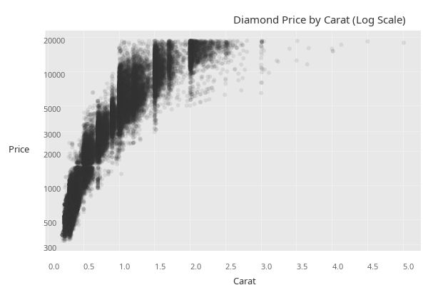
Summary with error bars (mean +/- SE)
Source: Vega-Lite: Error Bars with CI
(-> (rdatasets/reshape2-tips)
(pj/lay-summary :day :total-bill {:color :sex})
(pj/options {:title "Average Bill with Standard Error"}))Scatter with color and size (bubble)
Source: D3 Graph Gallery: Bubble Chart
(-> (rdatasets/gapminder-gapminder)
(tc/select-rows #(= 2007 (:year %)))
(pj/lay-point :gdp-percap :life-exp {:color :continent :size :pop})
(pj/scale :x :log)
(pj/options {:title "Gapminder 2007: Life Expectancy vs GDP"
:x-label "GDP per Capita (log)"
:y-label "Life Expectancy"}))Multi-series line chart
Source: Vega-Lite: Multi Series Line
(-> (rdatasets/gapminder-gapminder)
(tc/select-rows #(#{"Japan" "United States" "China" "India" "Brazil"} (:country %)))
(pj/lay-line :year :life-exp {:color :country})
(pj/options {:title "Life Expectancy Over Time"
:x-label "Year"
:y-label "Life Expectancy"}))Step chart
Source: Vega-Lite: Step Chart
(-> (rdatasets/ggplot2-economics)
(pj/lay-step :date :unemploy)
(pj/options {:title "US Unemployment (Step)"
:x-label "Date"
:y-label "Unemployed (thousands)"}))Density with rug marks
Source: Python Graph Gallery: Density with Rug
(-> (rdatasets/datasets-iris)
(pj/pose :sepal-length)
pj/lay-density
pj/lay-rug
(pj/options {:title "Iris Sepal Length: Density + Rug"}))Scatter + LOESS with confidence band
Source: Python Graph Gallery: Scatter with Smoothing
(-> (rdatasets/reshape2-tips)
(pj/pose :total-bill :tip {:color :smoker})
pj/lay-point
(pj/lay-smooth {:confidence-band true})
(pj/options {:title "Tips: Bill vs Tip by Smoking Status"
:x-label "Total Bill ($)"
:y-label "Tip ($)"}))Faceted histogram
Source: Vega-Lite: Faceted Histogram
(-> (rdatasets/ggplot2-mpg)
(pj/lay-histogram :hwy {:color :drv})
(pj/facet :drv)
(pj/options {:title "Highway MPG by Drive Type"}))Scatter with annotations
Source: R Graph Gallery: Scatter with Reference Lines
(-> (rdatasets/datasets-iris)
(pj/lay-point :sepal-length :sepal-width {:color :species})
(pj/lay-rule-h {:y-intercept 3.0})
(pj/lay-rule-v {:x-intercept 6.0})
(pj/lay-band-v {:x-min 5.0 :x-max 6.0 :alpha 0.1})
(pj/options {:title "Iris with Reference Lines and Band"}))Violin + boxplot overlay
Source: Python Graph Gallery: Violin with Box
(-> (rdatasets/reshape2-tips)
(pj/pose :day :total-bill)
pj/lay-violin
pj/lay-boxplot
(pj/options {:title "Tips Distribution by Day"}))Horizontal lollipop (ranked)
Source: R Graph Gallery: Lollipop
(-> (rdatasets/datasets-mtcars)
(pj/lay-lollipop :rownames :mpg)
(pj/coord :flip)
(pj/options {:title "Cars Ranked by MPG"}))Stacked bar (proportional / fill)
Source: Vega-Lite: Stacked Bar Normalized
Counts normalized to a proportion within each day:
(-> (rdatasets/reshape2-tips)
(pj/lay-bar :day {:position :fill :color :sex})
(pj/options {:title "Gender Proportion by Day (100% stacked)"}))Density normalized histogram overlay
Source: Python Graph Gallery: Histogram + Density
(-> (rdatasets/datasets-iris)
(pj/pose :sepal-length)
(pj/lay-histogram {:normalize :density})
pj/lay-density
(pj/options {:title "Sepal Length: Histogram + Density Curve"}))Equal aspect ratio scatter
Source: D3 Graph Gallery: scatter basic Using coord :fixed to ensure 1 data unit = 1 data unit on both axes.
(-> (rdatasets/datasets-iris)
(pj/lay-point :sepal-length :sepal-width {:color :species})
(pj/coord :fixed)
(pj/options {:title "Iris Sepals (Equal Aspect Ratio)"}))Value bar chart (pre-computed heights)
Source: ECharts: Basic Bar
(-> {:category ["Mon" "Tue" "Wed" "Thu" "Fri" "Sat" "Sun"]
:value [120 200 150 80 70 110 130]}
(pj/lay-bar :category :value)
(pj/options {:title "Weekly Sales"}))Colored density curves
Source: Python Graph Gallery: Multiple Density
(-> (rdatasets/datasets-iris)
(pj/lay-density :sepal-length {:color :species})
(pj/options {:title "Sepal Length by Species"
:x-label "Sepal Length (cm)"}))Scatter with LOESS + confidence band by group
Source: R Graph Gallery: Scatter with smoothing
(-> (rdatasets/datasets-iris)
(pj/pose :sepal-length :sepal-width {:color :species})
pj/lay-point
(pj/lay-smooth {:confidence-band true})
(pj/options {:title "Iris: Scatter + LOESS by Species"}))Errorbar chart
Source: Vega-Lite: Layered Point + Error Bar
(-> (rdatasets/datasets-iris)
(pj/lay-summary :species :sepal-length)
(pj/options {:title "Mean Sepal Length +/- SE by Species"}))Point + rug (marginal marks)
Source: Python Graph Gallery: Rug Plot
(-> (rdatasets/datasets-iris)
(pj/pose :sepal-length :sepal-width)
pj/lay-point
pj/lay-rug
(pj/options {:title "Iris: Scatter with Rug Marks"}))Connected Scatter and Evolution Charts
Connected scatter plot
Source: D3 Graph Gallery: Connected Scatter
Economy variables plotted against each other over time create a connected scatter plot. Subsampling every 12th month keeps it readable:
(-> (rdatasets/ggplot2-economics)
(as-> econ (tc/select-rows econ (range 0 (tc/row-count econ) 12)))
(pj/pose :unemploy :pce)
pj/lay-line
pj/lay-point
(pj/options {:title "US Economy: Unemployment vs Personal Consumption"
:x-label "Unemployed (thousands)"
:y-label "Personal Consumption Expenditures"}))Step chart with filled area
Source: Vega-Lite: Step Chart Source: ECharts: Step Area
Layering step and area creates a filled step chart:
(-> (rdatasets/ggplot2-economics)
(pj/pose :date :unemploy)
pj/lay-step
pj/lay-area
(pj/options {:title "US Unemployment (Step Area)"
:x-label "Date"
:y-label "Unemployed (thousands)"}))Area chart with line overlay
Source: ECharts: Basic Area
Layering area and line gives a filled region with a sharp boundary:
(-> (rdatasets/ggplot2-economics)
(pj/pose :date :psavert)
pj/lay-area
pj/lay-line
(pj/options {:title "US Personal Savings Rate"
:x-label "Date"
:y-label "Savings Rate (%)"}))Multi-series line chart (Texas housing)
Source: Vega-Lite: Multi Series Line
(-> (rdatasets/ggplot2-txhousing)
(tc/select-rows #(#{"Houston" "Dallas" "Austin" "San Antonio"} (:city %)))
(pj/pose :date :median {:color :city})
pj/lay-line
(pj/options {:title "Texas Median Home Prices"
:x-label "Date"
:y-label "Median Price ($)"}))Spaghetti plot (many series)
Source: Python Graph Gallery: Spaghetti Plot
Each subject in the sleep study gets a line showing reaction time over days:
(-> (rdatasets/lme4-sleepstudy)
(pj/pose :days :reaction {:color :subject :color-type :categorical})
pj/lay-line
pj/lay-point
(pj/options {:title "Sleep Deprivation: Reaction Time by Subject"
:x-label "Days of Sleep Deprivation"
:y-label "Reaction Time (ms)"}))Step chart of a single subject
Source: D3 Graph Gallery: Step Chart
(-> (rdatasets/lme4-sleepstudy)
(tc/select-rows #(= "308" (str (:subject %))))
(pj/pose :days :reaction)
pj/lay-step
pj/lay-point
(pj/options {:title "Subject 308: Reaction Time (Step)"
:x-label "Days"
:y-label "Reaction Time (ms)"}))Scatter Variations
Old Faithful eruptions
Source: R Graph Gallery: Basic Scatter
(-> (rdatasets/datasets-faithful)
(pj/pose :eruptions :waiting)
pj/lay-point
(pj/options {:title "Old Faithful Geyser"
:x-label "Eruption Duration (min)"
:y-label "Waiting Time (min)"}))Scatter with LOESS on Old Faithful
Source: Python Graph Gallery: Scatter with Smoothing
(-> (rdatasets/datasets-faithful)
(pj/pose :eruptions :waiting)
pj/lay-point
pj/lay-smooth
(pj/options {:title "Old Faithful with LOESS"
:x-label "Eruption Duration (min)"
:y-label "Waiting Time (min)"}))Scatter with alpha blending for overplotting
Source: Vega-Lite: Scatter with Opacity
Transparency reveals density in overplotted regions. Same ~54k-row dataset; raster output (:format :bufimg) keeps the page weight reasonable.
(-> (rdatasets/ggplot2-diamonds)
(pj/lay-point :carat :price {:alpha 0.05})
(pj/options {:title "Diamond Price vs Carat (alpha = 0.05)"
:x-label "Carat"
;; bufimg truncates long rotated y-labels; keep short.
:y-label "Price"
:format :bufimg}))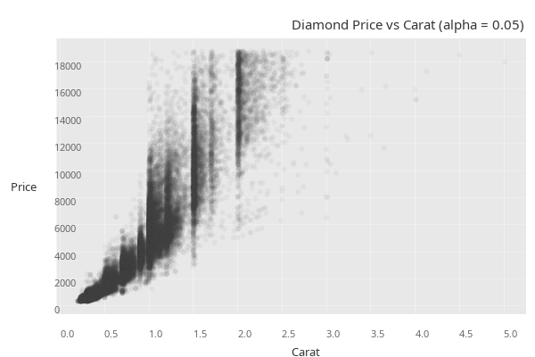
Scatter colored by continuous variable
Source: D3 Graph Gallery: Scatter Color
Color mapped to a continuous variable (horsepower):
(-> (rdatasets/datasets-mtcars)
(pj/lay-point :wt :mpg {:color :hp})
(pj/options {:title "Cars: Color by Horsepower"
:x-label "Weight (1000 lbs)"
:y-label "Miles per Gallon"}))Scatter with multiple aesthetics (color + size)
Source: D3 Graph Gallery: Bubble Chart
(-> (rdatasets/datasets-mtcars)
(pj/lay-point :hp :mpg {:color :cyl :size :disp})
(pj/options {:title "Cars: Color by Cylinders, Size by Displacement"
:x-label "Horsepower"
:y-label "Miles per Gallon"}))Bubble chart: Gapminder 2007
Source: D3 Graph Gallery: Bubble
(-> (tc/select-rows (rdatasets/gapminder-gapminder) #(= 2007 (:year %)))
(pj/lay-point :gdp-percap :life-exp {:color :continent :size :pop :alpha 0.6})
(pj/scale :x :log)
(pj/options {:title "Gapminder 2007"
:x-label "GDP per Capita (log)"
:y-label "Life Expectancy"}))Midwest demographics: scatter with size and transparency
Source: Python Graph Gallery: Bubble
(-> (rdatasets/ggplot2-midwest)
(pj/lay-point :percollege :percbelowpoverty {:color :state :size :poptotal :alpha 0.5})
(pj/options {:title "Midwest: College Education vs Poverty"
:x-label "Percent College Educated"
:y-label "Percent Below Poverty"}))Sleep study: body weight vs brain weight (log-log)
Source: ECharts: Scatter Logarithmic
(def msleep
(tc/drop-missing (rdatasets/ggplot2-msleep) [:sleep-total :bodywt :brainwt :vore]))(-> msleep
(pj/lay-point :bodywt :brainwt {:color :vore})
(pj/scale :x :log)
(pj/scale :y :log)
(pj/options {:title "Mammal Body vs Brain Weight (log-log)"
:x-label "Body Weight (kg, log)"
:y-label "Brain Weight (kg, log)"}))Scatter with equal aspect ratio
Source: Vega-Lite: Scatter with Fixed Aspect
(-> (rdatasets/datasets-iris)
(pj/pose :sepal-length :petal-length {:color :species})
pj/lay-point
(pj/coord :fixed)
(pj/options {:title "Iris: Sepal vs Petal Length (1:1 Aspect)"
:x-label "Sepal Length"
:y-label "Petal Length"}))Point + labels (top fuel-efficient cars)
Source: Vega-Lite: Text Marks
(-> (rdatasets/datasets-mtcars)
(tc/order-by [:mpg] :desc)
(tc/select-rows (range 5))
(pj/pose :wt :mpg)
pj/lay-point
(pj/lay-label {:text :rownames})
(pj/options {:title "Top 5 Most Fuel Efficient Cars"
:x-label "Weight (1000 lbs)"
:y-label "Miles per Gallon"}))Iris scatter with linear regression per species
Source: R Graph Gallery: Scatter with Groups
(-> (rdatasets/datasets-iris)
(pj/pose :petal-length :petal-width {:color :species})
pj/lay-point
(pj/lay-smooth {:stat :linear-model})
(pj/options {:title "Iris Petals with Linear Fit per Species"
:x-label "Petal Length"
:y-label "Petal Width"}))Linear regression with confidence band
Source: Vega-Lite: Regression + CI
(-> (rdatasets/datasets-mtcars)
(pj/pose :wt :mpg)
pj/lay-point
(pj/lay-smooth {:stat :linear-model :confidence-band true})
(pj/options {:title "Weight vs MPG with 95% Confidence Band"
:x-label "Weight (1000 lbs)"
:y-label "Miles per Gallon"}))Multiple smoothers on one plot
Source: R Graph Gallery: Multiple Smoothers
Linear regression and LOESS on the same axes:
(-> (rdatasets/datasets-mtcars)
(pj/pose :wt :mpg)
pj/lay-point
(pj/lay-smooth {:stat :linear-model})
pj/lay-smooth
(pj/options {:title "Cars: Linear Model and LOESS Smoothers"
:x-label "Weight (1000 lbs)"
:y-label "Miles per Gallon"}))Distribution Variations
Old Faithful histogram with density curve
Source: Python Graph Gallery: Histogram + Density
(-> (rdatasets/datasets-faithful)
(pj/pose :eruptions)
(pj/lay-histogram {:normalize :density :binwidth 0.25})
pj/lay-density
(pj/options {:title "Old Faithful: Histogram + Density"
:x-label "Eruption Duration (min)"
:y-label "Density"}))Density + rug on Old Faithful
Source: Python Graph Gallery: Density + Rug
(-> (rdatasets/datasets-faithful)
(pj/pose :eruptions)
pj/lay-density
pj/lay-rug
(pj/options {:title "Old Faithful: Density with Rug"
:x-label "Eruption Duration (min)"
:y-label "Density"}))Diamond depth density
Source: Vega-Lite: Density Plot
(-> (rdatasets/ggplot2-diamonds)
(pj/pose :depth)
pj/lay-density
(pj/options {:title "Distribution of Diamond Depth"
:x-label "Depth (%)"
:y-label "Density"}))Diamond depth histogram + density overlay
Source: Python Graph Gallery: Histogram + Density
(-> (rdatasets/ggplot2-diamonds)
(pj/pose :depth)
(pj/lay-histogram {:normalize :density})
pj/lay-density
(pj/options {:title "Diamond Depth: Histogram + Density"
:x-label "Depth (%)"
:y-label "Density"}))Colored density by species (petal width)
Source: Python Graph Gallery: Multiple Density
(-> (rdatasets/datasets-iris)
(pj/lay-density :petal-width {:color :species})
(pj/options {:title "Iris Petal Width by Species"
:x-label "Petal Width (cm)"
:y-label "Density"}))Colored density: mammal sleep
Source: Python Graph Gallery: Density by Group
(-> msleep
(pj/lay-density :sleep-total {:color :vore})
(pj/options {:title "Sleep Duration by Diet Type"
:x-label "Total Sleep (hours)"
:y-label "Density"}))Histogram with specific bin count
Source: Vega-Lite: Histogram with Bins
(-> (rdatasets/datasets-faithful)
(pj/pose :waiting)
(pj/lay-histogram {:bins 15})
(pj/options {:title "Waiting Time Between Eruptions (15 bins)"
:x-label "Waiting Time (min)"
:y-label "Count"}))Simulated approximately-normal distribution
Source: ECharts: Histogram
(-> {:value (repeatedly 500 #(+ (* 2.0 (rand)) (* 2.0 (rand)) (* 2.0 (rand)) -3.0))}
(pj/pose :value)
(pj/lay-histogram {:bins 30 :normalize :density})
pj/lay-density
(pj/options {:title "Simulated Distribution: Histogram + Density"
:x-label "Value"
:y-label "Density"}))Boxplot: chick weights by feed
Source: R Graph Gallery: Boxplot
(-> (rdatasets/datasets-chickwts)
(pj/pose :feed :weight {:color :feed})
pj/lay-boxplot
(pj/options {:title "Chick Weight by Feed Type"
:x-label "Feed"
:y-label "Weight (g)"}))Horizontal boxplot
Source: Python Graph Gallery: Horizontal Box
(-> (rdatasets/datasets-iris)
(pj/pose :species :sepal-length {:color :species})
pj/lay-boxplot
(pj/coord :flip)
(pj/options {:title "Iris Sepal Length (Horizontal Box)"
:x-label "Species"
:y-label "Sepal Length (cm)"}))Grouped boxplot
Source: Vega-Lite: 2D Box Plot
Boxplots split by both day and sex:
(-> (rdatasets/reshape2-tips)
(pj/pose :day :total-bill {:color :sex})
pj/lay-boxplot
(pj/options {:title "Tips by Day and Gender (Grouped Boxplot)"
:x-label "Day"
:y-label "Total Bill ($)"}))Violin: iris sepal width
Source: Python Graph Gallery: Violin
(-> (rdatasets/datasets-iris)
(pj/pose :species :sepal-width {:color :species})
pj/lay-violin
(pj/options {:title "Iris Sepal Width (Violin)"
:x-label "Species"
:y-label "Sepal Width (cm)"}))Horizontal violin
Source: Python Graph Gallery: Horizontal Violin
(-> (rdatasets/datasets-iris)
(pj/pose :species :petal-width {:color :species})
pj/lay-violin
(pj/coord :flip)
(pj/options {:title "Iris Petal Width (Horizontal Violin)"
:x-label "Species"
:y-label "Petal Width (cm)"}))Violin + points (raincloud-like)
Source: Python Graph Gallery: Raincloud Plot
Layering violin and points shows both distribution shape and individual observations:
(-> (rdatasets/reshape2-tips)
(pj/pose :day :total-bill)
pj/lay-violin
pj/lay-point
(pj/options {:title "Tips: Violin with Individual Points"
:x-label "Day"
:y-label "Total Bill ($)"}))Triple layer: violin + boxplot + points
Source: Python Graph Gallery: Violin + Box
All three distribution representations combined:
(-> (rdatasets/reshape2-tips)
(pj/pose :day :total-bill)
pj/lay-violin
pj/lay-boxplot
pj/lay-point
(pj/options {:title "Tips: Violin + Boxplot + Points"
:x-label "Day"
:y-label "Total Bill ($)"}))Violin by smoker status
Source: Python Graph Gallery: Violin by Group
(-> (rdatasets/reshape2-tips)
(pj/pose :smoker :total-bill {:color :smoker})
pj/lay-violin
(pj/options {:title "Total Bill by Smoking Status"
:x-label "Smoker"
:y-label "Total Bill ($)"}))Ridgeline: iris petal length
Source: Python Graph Gallery: Ridgeline
(-> (rdatasets/datasets-iris)
(pj/pose :species :petal-length)
pj/lay-ridgeline
(pj/options {:title "Iris Petal Length by Species (Ridgeline)"
:x-label "Species"
:y-label "Petal Length (cm)"}))Ridgeline: diamond price by color grade
Source: Python Graph Gallery: Ridgeline by Category
(-> (rdatasets/ggplot2-diamonds)
(pj/pose :color :price)
pj/lay-ridgeline
(pj/options {:title "Diamond Price by Color Grade (Ridgeline)"
:x-label "Color"
:y-label "Price ($)"}))Boxplot: airquality ozone by month
Source: R Graph Gallery: Box by Group
(def airquality
(-> (rdatasets/datasets-airquality)
(tc/drop-missing :ozone)
(tc/add-column :month-name
(fn [ds] (map #(get {5 "May" 6 "Jun" 7 "Jul" 8 "Aug" 9 "Sep"} %)
(ds :month))))))(-> airquality
(pj/pose :month-name :ozone {:color :month-name})
pj/lay-boxplot
(pj/options {:title "New York Ozone by Month"
:x-label "Month"
:y-label "Ozone (ppb)"}))Ranking Variations
Bar chart: mpg models per class
Source: Vega-Lite: Simple Bar
(-> (rdatasets/ggplot2-mpg)
(pj/pose :class)
pj/lay-bar
(pj/options {:title "Vehicle Count by Class"
:x-label "Class"
:y-label "Count"}))Grouped bar chart
Source: Vega-Lite: Grouped Bar
Counts of tips by day, grouped (dodged) by gender:
(-> (rdatasets/reshape2-tips)
(pj/lay-bar :day {:color :sex})
(pj/options {:title "Tips Count by Day and Gender"
:x-label "Day"
:y-label "Count"}))Horizontal value bar chart
Source: ECharts: Bar Horizontal
(-> {:country ["US" "China" "Japan" "Germany" "UK" "India" "France"]
:gdp [21.4 14.7 5.1 3.8 2.8 2.7 2.6]}
(pj/lay-bar :gdp :country)
(pj/options {:title "GDP by Country (2019)"
:x-label "GDP (Trillion $)"
:y-label "Country"}))Diverging bar chart
Source: Python Graph Gallery: Diverging Bar
Value bars support negative values, creating a diverging pattern:
(-> {:metric ["Quality" "Speed" "Usability" "Reliability" "Support" "Price" "Design" "Docs"]
:score [-30 -20 -10 5 15 25 35 45]}
(pj/lay-bar :score :metric)
(pj/lay-rule-v {:x-intercept 0})
(pj/options {:title "Customer Satisfaction Scores"
:x-label "Net Score"
:y-label "Metric"}))Lollipop: chick weight by feed
Source: R Graph Gallery: Lollipop
(-> (rdatasets/datasets-chickwts)
(tc/group-by [:feed])
(tc/aggregate {:mean-weight (fn [ds] (dfn/mean (ds :weight)))})
(pj/lay-lollipop :feed :mean-weight)
(pj/coord :flip)
(pj/options {:title "Mean Chick Weight by Feed Type"
:x-label "Feed"
:y-label "Mean Weight (g)"}))Lollipop: iris mean sepal length by species
Source: D3 Graph Gallery: Lollipop
(-> (rdatasets/datasets-iris)
(tc/group-by [:species])
(tc/aggregate {:mean-sl (fn [ds] (fstats/mean (ds :sepal-length)))})
(pj/lay-lollipop :species :mean-sl)
(pj/coord :flip)
(pj/options {:title "Mean Sepal Length by Species"
:x-label "Species"
:y-label "Mean Sepal Length (cm)"}))Heatmaps and 2D Density
2D density tile on Old Faithful
Source: R Graph Gallery: 2D Density
(-> (rdatasets/datasets-faithful)
(pj/pose :eruptions :waiting)
pj/lay-density-2d
(pj/options {:title "Old Faithful: 2D Density"
:x-label "Eruption Duration (min)"
:y-label "Waiting Time (min)"}))Scatter + density2d overlay on Old Faithful
Source: Python Graph Gallery: Scatter + 2D Density
(-> (rdatasets/datasets-faithful)
(pj/pose :eruptions :waiting)
pj/lay-point
pj/lay-density-2d
(pj/options {:title "Old Faithful: Scatter + Density"
:x-label "Eruption Duration (min)"
:y-label "Waiting Time (min)"}))Contour plot on Old Faithful
Source: D3 Graph Gallery: Contour
(-> (rdatasets/datasets-faithful)
(pj/pose :eruptions :waiting)
pj/lay-point
pj/lay-contour
(pj/options {:title "Old Faithful: Scatter + Contour"
:x-label "Eruption Duration (min)"
:y-label "Waiting Time (min)"}))Contour only (no scatter)
Source: Vega-Lite: Density Contour
(-> (rdatasets/datasets-iris)
(pj/pose :sepal-length :petal-length)
pj/lay-contour
(pj/options {:title "Iris: Sepal vs Petal Length Contour"
:x-label "Sepal Length"
:y-label "Petal Length"}))Pre-computed heatmap tile
Source: ECharts: Heatmap
Using faithfuld which has pre-computed density on a grid:
(-> (rdatasets/ggplot2-faithfuld)
(pj/pose :eruptions :waiting {:fill :density})
pj/lay-tile
(pj/options {:title "Old Faithful: Pre-computed Density Heatmap"
:x-label "Eruption Duration"
:y-label "Waiting Time"}))2D density on diamonds (scatter underneath)
Source: Python Graph Gallery: 2D Density
(-> (rdatasets/ggplot2-diamonds)
(tc/head 3000)
(pj/pose :carat :price)
pj/lay-point
pj/lay-density-2d
(pj/options {:title "Diamonds: Scatter + 2D Density"
:x-label "Carat"
:y-label "Price ($)"}))2D density on mpg
Source: Vega-Lite: Density Heatmap
(-> (rdatasets/ggplot2-mpg)
(pj/pose :displ :hwy)
pj/lay-density-2d
(pj/options {:title "MPG: Displacement vs Highway (Density)"
:x-label "Displacement (L)"
:y-label "Highway MPG"}))Numeric tile heatmap
Source: ECharts: Heatmap
(-> {:row (mapcat #(repeat 6 %) (range 6))
:col (flatten (repeat 6 (range 6)))
:value (map #(Math/sin (* % 0.5)) (range 36))}
(pj/pose :col :row {:fill :value})
pj/lay-tile
(pj/options {:title "Synthetic Heatmap (sin wave)"
:x-label "Column"
:y-label "Row"}))Error Bars and Summaries
Mean with error bars (pre-computed)
Source: Vega-Lite: Error Bar + Point
(-> (rdatasets/datasets-iris)
(tc/group-by [:species])
(tc/aggregate {:mean (fn [ds] (fstats/mean (ds :sepal-length)))
:y-min (fn [ds] (- (fstats/mean (ds :sepal-length))
(fstats/stddev (ds :sepal-length))))
:y-max (fn [ds] (+ (fstats/mean (ds :sepal-length))
(fstats/stddev (ds :sepal-length))))})
(pj/lay-errorbar :species :mean {:y-min :y-min :y-max :y-max})
(pj/lay-point :species :mean)
(pj/options {:title "Mean Sepal Length +/- SD by Species"
:x-label "Species"
:y-label "Sepal Length (cm)"}))Summary with error bars (built-in)
Source: Vega-Lite: Error Bar Summary
(-> (rdatasets/reshape2-tips)
(pj/lay-summary :day :tip {:color :sex})
(pj/options {:title "Mean Tip +/- SE by Day and Gender"
:x-label "Day"
:y-label "Tip ($)"}))Multi-Variable
Two y-variables side by side
Source: Vega-Lite: Layered Line
Two different y-variables, each in its own panel. Distinct positional aesthetics mean distinct poses; threading two pairs through pj/pose produces a horizontal row of panels.
(-> (rdatasets/ggplot2-economics)
(pj/pose [[:date :unemploy] [:date :uempmed]])
pj/lay-line
(pj/options {:title "Unemployment: Total vs Median Duration"}))Three series side by side
Source: ECharts: Multi Line
(-> (rdatasets/ggplot2-economics)
(pj/pose [[:date :unemploy] [:date :uempmed] [:date :psavert]])
pj/lay-line
(pj/options {:title "US Economic Indicators"}))Scatter + line, one per panel
Source: D3 Graph Gallery: Connected Scatter
Highway MPG as a scatter and city MPG as a line, side by side. The two columns get separate panels. Each panel uses a different layer type, threaded onto its own pose via pj/arrange.
(pj/arrange
[(-> (rdatasets/ggplot2-mpg)
(pj/lay-point :displ :hwy)
(pj/options {:title "Highway"}))
(-> (rdatasets/ggplot2-mpg)
(pj/lay-line :displ :cty)
(pj/options {:title "City"}))])Annotations
Scatter with reference lines
Source: R Graph Gallery: Annotation
(-> (rdatasets/datasets-iris)
(pj/pose :sepal-length :sepal-width)
pj/lay-point
(pj/lay-rule-h {:y-intercept 3.0})
(pj/lay-rule-h {:y-intercept 4.0})
(pj/lay-rule-v {:x-intercept 5.0})
(pj/lay-rule-v {:x-intercept 7.0})
(pj/options {:title "Iris: Scatter with Grid Lines"
:x-label "Sepal Length"
:y-label "Sepal Width"}))Scatter with highlight bands
Source: Vega-Lite: Rect Annotation
(-> (rdatasets/datasets-mtcars)
(pj/pose :wt :mpg)
pj/lay-point
(pj/lay-band-h {:y-min 20 :y-max 30})
(pj/lay-band-v {:x-min 2.5 :x-max 3.5})
(pj/options {:title "Cars: Scatter with Highlight Bands"
:x-label "Weight (1000 lbs)"
:y-label "MPG"}))Area chart with threshold line
Source: ECharts: Area with Mark Line
(-> (rdatasets/ggplot2-economics)
(pj/pose :date :unemploy)
pj/lay-area
(pj/lay-rule-h {:y-intercept 8000})
(pj/options {:title "US Unemployment with 8000 Threshold"
:x-label "Date"
:y-label "Unemployed (thousands)"}))Line chart with threshold annotation
Source: ECharts: Line with Mark
(-> airquality
(pj/lay-line :rownames :ozone)
(pj/lay-rule-h {:y-intercept 60})
(pj/options {:title "NYC Ozone with Threshold at 60 ppb"
:x-label "Observation"
:y-label "Ozone (ppb)"}))Scatter with safe zone band
Source: Vega-Lite: Rect Selection
(-> airquality
(pj/pose :wind :ozone)
pj/lay-point
(pj/lay-band-h {:y-min 0 :y-max 40})
(pj/options {:title "Ozone vs Wind: Safe Zone Highlighted"
:x-label "Wind Speed (mph)"
:y-label "Ozone (ppb)"}))Faceted Charts
Facet-wrap scatter by class
Source: Vega-Lite: Faceted Scatter
(-> (rdatasets/ggplot2-mpg)
(pj/pose :displ :hwy)
pj/lay-point
(pj/facet :class)
(pj/options {:title "MPG: Faceted by Vehicle Class"
:x-label "Displacement"
:y-label "Highway MPG"}))Facet-grid: rows by drive, columns by year
Source: Vega-Lite: Trellis Grid
(-> (rdatasets/ggplot2-mpg)
(pj/pose :displ :hwy)
pj/lay-point
(pj/facet-grid :drv :year)
(pj/options {:title "MPG: Drive Type x Model Year"
:x-label "Displacement"
:y-label "Highway MPG"}))Facet-grid: rows by drive, columns by class
Source: Vega-Lite: Trellis Grid Multi
The Vega-Lite original facets by :cyl. Plotje’s pj/facet-grid accepts any column type – distinct values become panel labels – so this example uses :class purely for visual variety.
(-> (rdatasets/ggplot2-mpg)
(pj/pose :displ :hwy)
pj/lay-point
(pj/facet-grid :drv :class)
(pj/options {:title "MPG: Drive x Class"
:x-label "Displacement"
:y-label "Highway MPG"}))Facet-grid column only
Source: Vega-Lite: Column Facet
(-> (rdatasets/ggplot2-mpg)
(pj/pose :displ :hwy)
pj/lay-point
(pj/facet-grid nil :drv)
(pj/options {:title "MPG: Column Facets by Drive Type"
:x-label "Displacement"
:y-label "Highway MPG"}))Faceted density
Source: Python Graph Gallery: Small Multiples Density
(-> (rdatasets/datasets-iris)
(pj/pose :petal-length)
pj/lay-density
(pj/facet :species)
(pj/options {:title "Petal Length Density by Species"
:x-label "Petal Length (cm)"
:y-label "Density"}))Faceted boxplot
Source: Vega-Lite: Faceted Boxplot
(-> (rdatasets/reshape2-tips)
(pj/pose :day :total-bill)
pj/lay-boxplot
(pj/facet :sex)
(pj/options {:title "Total Bill by Day, Faceted by Gender"
:x-label "Day"
:y-label "Total Bill ($)"}))Faceted violin
Source: Python Graph Gallery: Faceted Violin
(-> (rdatasets/reshape2-tips)
(pj/pose :day :total-bill)
pj/lay-violin
(pj/facet :sex)
(pj/options {:title "Total Bill Violin by Day, Faceted by Gender"
:x-label "Day"
:y-label "Total Bill ($)"}))Faceted bar chart
Source: Vega-Lite: Trellis Bar
(-> (rdatasets/ggplot2-mpg)
(pj/pose :class)
pj/lay-bar
(pj/facet :year)
(pj/options {:title "Vehicle Class Count by Model Year"
:x-label "Class"
:y-label "Count"}))Faceted scatter + regression per panel
Source: Vega-Lite: Faceted with Regression
(-> (rdatasets/datasets-iris)
(pj/pose :petal-length :petal-width)
pj/lay-point
(pj/lay-smooth {:stat :linear-model})
(pj/facet :species)
(pj/options {:title "Iris Petals: Faceted Regression"
:x-label "Petal Length"
:y-label "Petal Width"}))Facet-grid with boxplot
Source: Vega-Lite: Faceted Box
(-> (rdatasets/reshape2-tips)
(pj/pose :day :total-bill)
pj/lay-boxplot
(pj/facet-grid :time :smoker)
(pj/options {:title "Tips: Day x Time x Smoker"
:x-label "Day"
:y-label "Total Bill ($)"}))Faceted scatter (Gapminder by continent)
Source: D3 Graph Gallery: Small Multiples
(-> (tc/select-rows (rdatasets/gapminder-gapminder) #(= 2007 (:year %)))
(pj/pose :gdp-percap :life-exp)
pj/lay-point
(pj/scale :x :log)
(pj/facet :continent)
(pj/options {:title "Gapminder 2007 by Continent"
:x-label "GDP per Capita (log)"
:y-label "Life Expectancy"}))Faceted line + point (sleepstudy per subject)
Source: Python Graph Gallery: Small Multiples
(-> (rdatasets/lme4-sleepstudy)
(pj/pose :days :reaction)
pj/lay-line
pj/lay-point
(pj/facet :subject)
(pj/options {:title "Sleep Study: Each Subject"
:x-label "Days"
:y-label "Reaction Time (ms)"}))Faceted scatter + LOESS (mpg by cylinder)
Source: Vega-Lite: Faceted with Loess
(-> (rdatasets/ggplot2-mpg)
(pj/pose :displ :hwy)
pj/lay-point
pj/lay-smooth
(pj/facet :cyl)
(pj/options {:title "MPG: Scatter + LOESS by Cylinder Count"
:x-label "Displacement"
:y-label "Highway MPG"}))Scatter Plot Matrices
Compact SPLOM (3 variables)
Source: Vega-Lite: SPLOM
(-> (rdatasets/datasets-mtcars)
(pj/pose (pj/cross [:mpg :hp :wt] [:mpg :hp :wt]))
(pj/options {:title "Motor Trend Cars: 3x3 SPLOM"}))SPLOM (2 variables)
Source: D3 Graph Gallery: SPLOM
(-> (rdatasets/datasets-mtcars)
(pj/pose (pj/cross [:mpg :wt] [:mpg :wt]))
(pj/options {:title "MPG vs Weight: 2x2 SPLOM"}))Scale Variations
Log scale scatter
Source: ECharts: Scatter Logarithmic
(-> (rdatasets/ggplot2-diamonds)
(tc/head 2000)
(pj/lay-point :carat :price {:alpha 0.15})
(pj/scale :y :log)
(pj/options {:title "Diamond Price (Log Scale)"
:x-label "Carat"
:y-label "Price ($, log)"}))Log-log scatter
Source: Python Graph Gallery: Log-Log Scale
(-> msleep
(pj/lay-point :bodywt :sleep-total {:color :vore})
(pj/scale :x :log)
(pj/options {:title "Body Weight vs Sleep (log x-axis)"
:x-label "Body Weight (kg, log)"
:y-label "Total Sleep (hours)"}))Part of Whole
Stacked bar (diamonds cut by color)
Source: Vega-Lite: Stacked Bar
(-> (rdatasets/ggplot2-diamonds)
(pj/pose :cut {:color :color})
(pj/lay-bar {:position :stack})
(pj/options {:title "Diamonds by Cut and Color (Stacked)"
:x-label "Cut"
:y-label "Count"}))Bar + point overlay
Source: Vega-Lite: Layered Bar
Layering bar and point gives a dot-on-bar pattern:
(-> (rdatasets/reshape2-tips)
(pj/pose :day :total-bill)
pj/lay-bar
pj/lay-point
(pj/options {:title "Tips: Bar Count with Individual Points"
:x-label "Day"
:y-label "Total Bill ($)"}))Density-Based Views
Two density-based examples: a 2D density of iris measurements, and a contour-plus-scatter of the diamonds data.
Iris density2d
Source: Python Graph Gallery: 2D Density
(-> (rdatasets/datasets-iris)
(pj/pose :sepal-length :sepal-width {:color :species})
pj/lay-density-2d
(pj/options {:title "Iris: 2D Density by Species"
:x-label "Sepal Length"
:y-label "Sepal Width"}))Diamonds contour with scatter
Source: D3 Graph Gallery: Contour
(-> (rdatasets/ggplot2-diamonds)
(tc/head 1000)
(pj/pose :carat :price)
pj/lay-contour
pj/lay-point
(pj/options {:title "Diamonds: Contour + Scatter"
:x-label "Carat"
:y-label "Price ($)"}))Timelines
Gantt schedule by team
Source: R Graph Gallery: Gantt Chart
Horizontal interval bars with one row per task, dates as bar bounds, and color encoding the responsible team.
(-> {:task ["Design" "Build" "Integration" "Testing" "Launch"]
:start [#inst "2024-01-01" #inst "2024-02-15"
#inst "2024-04-01" #inst "2024-05-01"
#inst "2024-06-01"]
:end [#inst "2024-02-15" #inst "2024-04-15"
#inst "2024-05-01" #inst "2024-06-01"
#inst "2024-06-15"]
:team ["A" "B" "B" "C" "A"]}
(pj/lay-interval-h :start :task {:x-end :end :color :team})
(pj/options {:title "Project Schedule by Team"}))