17 Cookbook
Practical plotting recipes – how to combine marks, overlay stats, and build finished charts.
(ns plotje-book.cookbook
  (:require
   ;; Tablecloth -- dataset manipulation
   [tablecloth.api :as tc]
   ;; Kindly -- notebook rendering protocol
   [scicloj.kindly.v4.kind :as kind]
   ;; Plotje -- composable plotting
   [scicloj.plotje.api :as pj]
   ;; Fastmath -- random number generation
   [fastmath.random :as rng]
   ;; Java-time -- idiomatic date/time construction
   [java-time.api :as jt]
   ;; Rdatasets -- additional datasets beyond the shared ones
   [scicloj.metamorph.ml.rdatasets :as rdatasets]))
Quick Recipes
Boxplot with jittered points
Overlay raw observations on a boxplot summary. The auto-jitter detects the categorical axis and constrains points to the band width.
(-> (rdatasets/datasets-iris)
    (pj/lay-boxplot :species :sepal-length)
(pj/lay-point {:jitter true :alpha 0.3}))Histogram with density overlay
Normalize the histogram to density scale so it is comparable with the KDE (kernel density estimation) curve.
(-> (rdatasets/datasets-iris)
    (pj/lay-histogram :sepal-length {:normalize :density :alpha 0.5})
pj/lay-density)Scatter with regression lines
Fit a linear regression per group to reveal trends across species.
(-> (rdatasets/datasets-iris)
    (pj/pose :sepal-length :sepal-width {:color :species})
    (pj/lay-point {:alpha 0.6})
(pj/lay-smooth {:stat :linear-model}))Violin with jittered points
Show the density shape and every observation together.
(-> (rdatasets/datasets-iris)
    (pj/lay-violin :species :petal-width {:alpha 0.3})
(pj/lay-point {:jitter true :alpha 0.4}))Time series with multiple layers
Combine area, line, and points. Date columns are detected automatically – ticks snap to calendar boundaries.
(def ts-dates (take 52 (jt/iterate jt/plus (jt/local-date 2020 1 6) (jt/weeks 1))))(def ts-ds {:date ts-dates
:value (map #(+ 100.0 (* 30.0 (Math/sin (* (double %) 0.12))))
(range 52))})(-> ts-ds
(pj/lay-area :date :value {:alpha 0.2})
pj/lay-line
(pj/lay-point {:alpha 0.5}))Faceted comparison
Split a scatter plot by species to compare patterns side by side.
(-> (rdatasets/datasets-iris)
    (pj/lay-point :sepal-length :sepal-width {:color :species})
(pj/facet :species))Annotated chart
Add reference lines and shaded bands to highlight regions of interest. Pass {:alpha ...} to control band opacity.
(-> (rdatasets/datasets-iris)
    (pj/lay-point :sepal-length :sepal-width {:color :species})
    (pj/lay-rule-h {:y-intercept 3.0})
(pj/lay-band-v {:x-min 5.5 :x-max 6.5 :alpha 0.3}))Gantt schedule
A horizontal interval bar per task, with the bar’s left edge at the start date and the right edge at the end date. The Timelines chapter has more variations (color by team, vertical orientation, presidential terms); this is the minimal recipe.
(-> {:task  ["Design" "Build" "Test" "Ship"]
     :start [#inst "2024-01-01" #inst "2024-02-01"
             #inst "2024-03-15" #inst "2024-04-15"]
     :end   [#inst "2024-02-01" #inst "2024-03-20"
             #inst "2024-04-15" #inst "2024-05-01"]}
    (pj/lay-interval-h :start :task {:x-end :end})
(pj/options {:title "Project schedule"}))Ridgeline with color
Compare distribution shapes across categories with overlapping density curves. Grid lines at each baseline aid comparison.
(-> (rdatasets/datasets-iris)
(pj/lay-ridgeline :species :sepal-length {:color :species}))Stacked bars (proportions)
Show the proportion of each species per island using 100% stacked bars.
(-> (rdatasets/palmerpenguins-penguins)
(pj/lay-bar :island {:position :fill :color :species}))Multi-Layer Compositions
Overall regression with per-group points
Color points by group, but fit a single overall regression line.
(-> (rdatasets/datasets-iris)
    (pj/lay-point :sepal-length :sepal-width {:color :species})
(pj/lay-smooth {:stat :linear-model :color nil}))Different data per layer
Each lay-* accepts {:data ...} to override the pose-level dataset. This lets you overlay marks from two different tables – ggplot2’s geom_line(data=df2) + geom_point(data=df1) pattern.
(-> (rdatasets/datasets-iris)
    (pj/lay-point :sepal-length :sepal-width {:alpha 0.3})
    (pj/lay-point {:data {:sepal-length [5.0 6.5]
                          :sepal-width [3.5 3.0]}
                   :x :sepal-length :y :sepal-width
:color "red" :size 6}))Points with error bars
Combining point and errorbar layers shows measurements with uncertainty.
(def experiment
  {:condition ["A" "B" "C" "D"]
   :mean [10.0 15.0 12.0 18.0]
   :ci_lo [8.0 12.0 9.5 15.5]
:ci_hi [12.0 18.0 14.5 20.5]})(-> experiment
(pj/lay-point :condition :mean {:size 5})
(pj/lay-errorbar {:y-min :ci_lo :y-max :ci_hi}))Lollipop with error bars
Composing lollipop stems with error bars.
(-> experiment
    (pj/lay-lollipop :condition :mean)
(pj/lay-errorbar {:y-min :ci_lo :y-max :ci_hi}))Summary (mean +/- SE) with raw data
The summary layer type computes mean and SE (standard error) per category.
(-> (rdatasets/datasets-iris)
    (pj/lay-point :species :sepal-length {:alpha 0.3 :jitter 5})
(pj/lay-summary {:color :species}))Tipping behavior
Scatter + per-group regression to compare smoker tipping patterns.
(-> (rdatasets/reshape2-tips)
    (pj/pose :total-bill :tip {:color :smoker})
    pj/lay-point
    (pj/lay-smooth {:stat :linear-model})
    (pj/options {:title "Tipping Behavior"
                 :x-label "Total Bill ($)"
:y-label "Tip ($)"}))More Recipes
Confidence band
A scatter plot with per-group linear regressions and 95% confidence bands.
(-> (rdatasets/datasets-iris)
    (pj/pose :sepal-length :sepal-width {:color :species})
    (pj/lay-point {:alpha 0.5})
    (pj/lay-smooth {:stat :linear-model :confidence-band true})
(pj/options {:title "Sepal Regression with Confidence Bands"}))Stacked vs grouped bars
Side-by-side comparison: default dodged bars vs stacked bars.
(-> (rdatasets/reshape2-tips)
    (pj/lay-bar :day {:color :sex})
(pj/options {:title "Dodged Bars (default)"}))(-> (rdatasets/reshape2-tips)
(pj/lay-bar :day {:position :stack :color :sex})
(pj/options {:title "Stacked Bars"}))Step line
A step plot for discrete time series data – useful when values hold constant between observations.
(def daily-temps
  {:day (range 1 15)
:temp [12 14 14 16 18 17 15 13 14 16 19 21 20 18]})(-> daily-temps
(pj/lay-step :day :temp {:color "#2196F3"})
(pj/lay-point {:color "#2196F3" :size 3})
(pj/options {:title "Daily Temperature (Step)"}))Contour + scatter
Density contour lines overlaid on a scatter plot – reveals high-density regions in a point cloud.
(-> (rdatasets/datasets-iris)
    (pj/lay-point :sepal-length :sepal-width {:color :species :alpha 0.4})
(pj/lay-contour {:levels 5}))Label marks
Annotate specific data points with text labels.
(def top5
  (-> (rdatasets/datasets-iris)
      (tc/order-by :sepal-length :desc)
(tc/head 5)))(-> top5
(pj/lay-point :sepal-length :sepal-width {:size 5})
(pj/lay-label {:text :species :nudge-y 0.15}))Value labels inside bars
To print a value on each bar, overlay a lay-text layer added after the bar so it paints on top. Use :align-x :right so the label’s right edge sits at the bar’s end, tucking the text inside the fill (extending leftward) rather than spilling past the bar.
(def species-share
  {:species ["setosa" "versicolor" "virginica"]
:percent [33.3 33.3 33.3]})(-> species-share
(pj/lay-bar :species :percent {:color "#a6cee3"})
(pj/lay-text :species :percent {:text :percent :align-x :right})
(pj/coord :flip))Custom palette map
Assign specific colors to each category using a palette map.
(-> (rdatasets/datasets-iris)
    (pj/lay-point :sepal-length :sepal-width {:color :species})
    (pj/options {:palette {:setosa "#E91E63"
                           :versicolor "#4CAF50"
                           :virginica "#2196F3"}
:title "Custom Palette Map"}))Fixed aspect ratio
Use pj/coord :fixed so one unit on x equals one unit on y. This makes the plot square when x and y have equal ranges.
(-> (rdatasets/datasets-iris)
    (pj/pose :sepal-length :sepal-width {:color :species})
    pj/lay-point
    (pj/lay-smooth {:stat :linear-model})
    (pj/coord :fixed)
(pj/options {:title "Fixed Aspect Ratio"}))Diverging color scale
Use :color-scale :diverging with :color-midpoint to center a red-white-blue gradient on a meaningful value (e.g., zero).
(-> {:x (range 20)
     :y (map #(Math/sin (/ % 3.0)) (range 20))
     :change (map #(- % 10) (range 20))}
    (pj/lay-point :x :y {:color :change})
    (pj/options {:color-scale :diverging
                 :color-midpoint 0
:title "Diverging Color Scale"}))LOESS (local regression) confidence ribbon
Add {:confidence-band true} to a LOESS smoother for a bootstrap confidence band.
(-> (rdatasets/datasets-iris)
    (pj/pose :sepal-length :sepal-width {:color :species})
    pj/lay-point
    (pj/lay-smooth {:confidence-band true})
(pj/options {:title "LOESS with 95% CI"}))Multi-plot dashboard
Use pj/arrange to combine independent plots into a grid layout.
(def iris-sepal
  (-> (rdatasets/datasets-iris)
      (pj/lay-point :sepal-length :sepal-width {:color :species})
(pj/options {:title "Sepal" :width 300 :height 250})))(def iris-petal
(-> (rdatasets/datasets-iris)
(pj/lay-point :petal-length :petal-width {:color :species})
(pj/options {:title "Petal" :width 300 :height 250})))(pj/arrange [iris-sepal iris-petal]
{:title "Iris Dashboard" :cols 2})Labeled scatter
Combine points with text labels, using nudge to offset text from data points.
(def top-cities
  {:city ["Tokyo" "Delhi" "Shanghai" "São Paulo" "Mumbai"]
   :population [37.4 32.9 29.2 22.4 21.7]
:area [2194 1484 6341 1521 603]})(-> top-cities
(pj/lay-point :area :population)
(pj/lay-text {:text :city :nudge-y 1.0})
(pj/options {:title "Population vs Area"}))Simulated Data
Generate data from a known model and verify the regression recovers it.
(let [r (rng/rng :jdk 77)
      xs (range 0 10 0.5)
      ys (map #(+ (* 3 %)
                  5
                  (* 2 (- (rng/drandom r) 0.5)))
              xs)]
  (-> {:x xs :y ys}
      (pj/lay-point :x :y)
      (pj/lay-smooth {:stat :linear-model})
(pj/options {:title "Simulated: y = 3x + 5 + noise"})))Analytical Walkthroughs
Palmer Penguins
Bill dimensions separate the three species clearly.
(-> (rdatasets/palmerpenguins-penguins)
    (pj/lay-point :bill-length-mm :bill-depth-mm {:color :species})
(pj/options {:title "Palmer Penguins: Bill Dimensions"}))Per-species regression reveals different slopes.
(-> (rdatasets/palmerpenguins-penguins)
    (pj/pose :bill-length-mm :bill-depth-mm {:color :species})
    pj/lay-point
    (pj/lay-smooth {:stat :linear-model})
(pj/options {:title "Bill Length vs Depth with Regression"}))Without grouping, the overall trend appears negative – an example of Simpson’s paradox.
(-> (rdatasets/palmerpenguins-penguins)
    (pj/lay-point :bill-length-mm :bill-depth-mm {:color :species})
    (pj/lay-smooth {:stat :linear-model :color nil})
(pj/options {:title "Simpson's Paradox: Overall vs Per-Group Trend"}))Species distribution across islands.
(-> (rdatasets/palmerpenguins-penguins)
    (pj/lay-bar :island {:color :species})
(pj/options {:title "Species by Island"}))Flipper length vs body mass – a strong positive correlation.
(-> (rdatasets/palmerpenguins-penguins)
    (pj/pose :flipper-length-mm :body-mass-g {:color :species})
    pj/lay-point
    (pj/lay-smooth {:stat :linear-model})
(pj/options {:title "Flipper Length vs Body Mass"}))Body mass distribution by species.
(-> (rdatasets/palmerpenguins-penguins)
    (pj/lay-histogram :body-mass-g {:color :species})
(pj/options {:title "Body Mass Distribution"}))Tips
Tipping behavior: smokers vs non-smokers.
(-> (rdatasets/reshape2-tips)
    (pj/pose :total-bill :tip {:color :smoker})
    pj/lay-point
    (pj/lay-smooth {:stat :linear-model})
    (pj/options {:title "Tipping: Smokers vs Non-Smokers"
:x-label "Total Bill ($)" :y-label "Tip ($)"}))Tip amounts by day, colored by meal time.
(-> (rdatasets/reshape2-tips)
    (pj/lay-bar :day {:color :time})
(pj/options {:title "Visits by Day and Meal Time"}))Stacked view of the same data.
(-> (rdatasets/reshape2-tips)
    (pj/lay-bar :day {:position :stack :color :time})
(pj/options {:title "Visits by Day (Stacked)"}))Horizontal bar chart of party sizes.
(-> (rdatasets/reshape2-tips)
    (pj/lay-bar :day {:color :sex})
    (pj/coord :flip)
(pj/options {:title "Day by Gender (Horizontal)"}))MPG
Engine displacement vs highway fuel efficiency, colored by vehicle class.
(-> (rdatasets/ggplot2-mpg)
    (pj/pose :displ :hwy {:color :class})
    pj/lay-point
    (pj/lay-smooth {:stat :linear-model})
    (pj/options {:title "Displacement vs Highway MPG by Class"}))
Displacement vs city MPG – a similar negative correlation.
(-> (rdatasets/ggplot2-mpg)
    (pj/lay-point :displ :cty {:color :drv})
(pj/options {:title "Engine Displacement vs City Fuel Efficiency"}))Count of cars by drive type.
(-> (rdatasets/ggplot2-mpg)
    (pj/lay-bar :drv)
(pj/options {:title "Cars by Drive Type"}))Large Datasets and Raster Output
By default Plotje renders to SVG, which produces scalable charts that stay sharp at any zoom. But when a plot has tens of thousands of points, the browser must parse and layout a huge SVG DOM. For example, the full diamonds dataset (53,940 rows) produces an 11 MB SVG file.
Setting :format :bufimg renders the plot to a java.awt.image.BufferedImage via membrane’s Java2D backend instead of SVG. For plots with many thousands of points, the raster output is substantially smaller than the equivalent SVG.
SVG (default)
This is the default SVG output for a smaller subset:
(-> (rdatasets/ggplot2-diamonds)
    (tc/head 500)
    (pj/lay-point :carat :price {:color :cut})
(pj/options {:title "Diamonds (500 rows, SVG)"}))BufferedImage output
With :format :bufimg, the full dataset renders as a raster image in the notebook:
(-> (rdatasets/ggplot2-diamonds)
    (pj/lay-point :carat :price {:color :cut :alpha 0.3})
    (pj/options {:title "Diamonds (53,940 rows, BufferedImage)"
                 :format :bufimg}))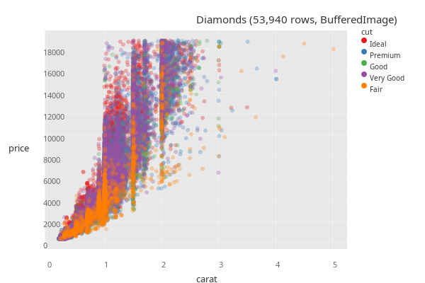
Saving to PNG
Use pj/save with a .png path to write a raster image to disk. The format is inferred from the extension:
(let [path (str (java.io.File/createTempFile "plotje-diamonds" ".png"))]
  (-> (rdatasets/ggplot2-diamonds)
      (pj/lay-point :carat :price {:color :cut})
      (pj/save path))
  ;; Read the first eight bytes and check for PNG magic.
  (with-open [in (java.io.FileInputStream. path)]
    (let [bs (byte-array 8)]
      (.read in bs)
(mapv #(bit-and ^int % 0xFF) (vec bs)))))[137 80 78 71 13 10 26 10]The same call with an explicit {:format :png} makes the format choice unambiguous, useful when the path is built dynamically:
(-> (rdatasets/ggplot2-diamonds)
    (pj/lay-point :carat :price {:color :cut})
    (pj/save out-path {:format :png}))
Two vocabularies: plot return type vs save file format
The two paths above use the same :format keyword for different jobs. pj/plot names a JVM return type:
:svg– hiccup:bufimg– a Java2DBufferedImage
pj/save names the file format:
:svg– SVG file:png– PNG file
A pose’s :opts {:format ...} flows into both contexts. If you pin :format :bufimg on a pose so the notebook renders raster, saving that pose still produces a PNG file – the save path reinterprets the pose-level :bufimg as :png because what is written to disk is a PNG.
See Also
- Core Concepts – the mapping, scope, and identity rules behind these recipes
- Composition – composite poses for multi-panel layouts
What’s Next
- Configuration – control dimensions, palettes, and themes at every scope
- Customization – annotations, tooltips, and brush selection